Instead of setting media query breakpoints, use fluid typography to create a more "fluid" (or gradual) transition between font sizes and line heights that change proportionally according to the width of the viewport.
A combination of mathematics and CSS's clamp() function are used to achieve this effect.
Responsive Font Size
In responsive web design, we use media query breakpoints in order to make a website's content respond in a certain way depending on the viewport's width.
Consider the following example of responsive font size :
@media (max-width: 414px) {
  h1 {
    font-size: 16px;
  }
}

@media (min-width: 415px) and (max-width: 768px) {
  h1 {
    font-size: 32px;
  }
}

@media (min-width: 769px) {
  h1 {
    font-size: 48px;
  }
}
The CSS defines the font-size property of the h1 element when the viewport is at various breakpoints.
- For viewports up to
414pxwide, the font size is16px. - For viewports between
415pxand768px, the font size is32px. - For viewports of at least
769pxwide, the font size is48px.
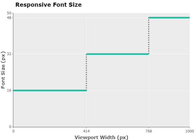
This responsive approach causes the font size to "jump" from 16px to 32px when the viewport's width goes from 414px to 415px. This "jump" from one font size to another also happens when the width goes from 768px to 769px, or from 769px to 768px, or from 415px to 414px.
Basic Fluid Font Size
One way to avoid this "jump" side effect (and achieve a more "fluid" effect, instead) is to use the viewport's current width — as opposed to using predefined breakpoints — when setting the font size. We can do this by using CSS's viewport unit for width: vw.
There are four viewport-based units in CSS:
vwvhvminvmax
vw is a relative length unit representing a percentage of the viewport's width. For example, 50vw is 50% of the viewport's width. So, given a viewport that is 1280px wide, 50vw means 50% of that 1280px, which is 640px
You can learn more about viewport-based units on the MDN Web Docs .
Let's update our example and set the font-size property of the h1 element to 10vw :
h1 {
  font-size: 10vw;
}
As the viewport's width changes, the value of the font-size property adjusts proportionally:
- When the viewport's width is
400px, the font-size property is set to 10% of400px, which is40px. - When the viewport's width is
800px, the font-size property is set to 10% of800px, which is80px.
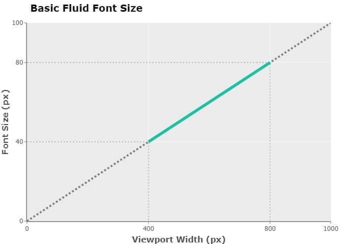
The changes to the font size will now present with fluidity.
Intermediate Fluid Font Size
One drawback to setting the value of the font-size property to a vw unit is precision control. What if you wanted the font size to be:
32pxwhen the viewport's width is414px,48pxwhen the viewport's width is768px, and- proportionally in between
32pxand48pxwhen the viewport's width is in between414pxand768px?
A simple assignment of a vw value to the font-size property is no longer an option. Instead, we need to use a combination of CSS's calc() function and a couple of mathematical formulas.
According to the MDN Web Docs,
The calc() CSS function lets you perform calculations when specifying CSS property values.
And for the purpose of fluid font size, the calc() function will suffice.
The first mathematical formula we need to be aware of is the point-slope form equation of a line:
y - y1 = m(x - x1)
Where:
y= y coordinate of the second pointy1= y coordinate of the first pointm= slope of the line formed by the two points with coordinates (x, y) and (x1, y1)x= x coordinate of the second pointx1= x coordinate of the first point
y represents the unknown font size for a given viewport width (x). The coordinates (x1, y1) represent any given point on the line.
Before we can use the point-slope form, we first need to compute what slope m is. The formula to calculate slope m (also known as the gradient of a line) is:
m = (y2 - y1) / (x2 - x1)
Where:
m = slope of the line formed by the two points (x1, y1) and (x2, y2)
(x1, y1)= coordinates of the first point(x2, y2)= coordinates of the second point
We want our font size to be 32px when the viewport is 414px wide. So, let:
x1=32pxy1=414px
Thus, the coordinates of our first point are:
(414, 32)
We want our font size to be 48px when the viewport is 768px wide. So, let:
x2=768pxy2=48px
Thus, the coordinates of our second point are:
(768, 48)
Now, let's plug in the given values to the formula m = (y2 — y1) / (x2 — x1) to compute our slope:
m = (48 - 32) / (768 - 414)m = 16 / 354m = 0.04519774011
Now that we have the value of slope m, we can get back to our point-slope form:
y - y1 = m(x - x2)
Note that the coordinates (x1, y1) represent a point on the line with a slope m = 0.04519774011 (based on our previous calculations).
Using the formula y — y1 = m(x — x1), we can now solve for the unknown font size (y) when viewport width (x) is, for example, 591px (which is halfway between 414px and 768px; we can intuitively estimate that the unknown font size (y) should therefore be halfway between 32px and 48px):
y - 32 = 0.04519774011 (591 - 414)y - 32 = 0.04519774011 (177)y - 32 = 7.9999999977y = 7.9999999977 + 32y = 39.9999999977
As expected, font size (y) is halfway between 32px and 48px.
Now, how do we use all this math in CSS to achieve fluid font size? This is where the CSS calc() function comes in.
Let's update our example to use CSS's calc() function :
:root {
  /* Declare without units so we can compute the slope */
  --min-vw: 414;
  --max-vw: 768;
  --min-h1-font-size: 32;
  --max-h1-font-size: 48;

  /* m = (y2 - y1) / (x2 - x1)  */
  --rise: calc(var(--max-h1-font-size) - var(--min-h1-font-size));
  --run: calc(var(--max-vw) - var(--min-vw));
  --slope: calc(var(--rise) / var(--run));
}

h1 {
  /* Due to the way addition and subtraction works in calc(),
  we need to "type cast" --min-vw and --min-h1-font-size to appropriate units */
  --min-vw-px: calc(var(--min-vw) * 1px);
  --min-h1-font-size-px: calc(var(--min-h1-font-size) * 1px);

  /* y - y1 = m(x - x1) */
  --fluid-font-size-px:
    calc(
      var(--slope) * (100vw - var(--min-vw-px)) + var(--min-h1-font-size-px)
    );

  font-size: var(--fluid-font-size-px);
}
The key to making fluid font size work in our example is the use of 100vw for the value of x in the point-slope formula.
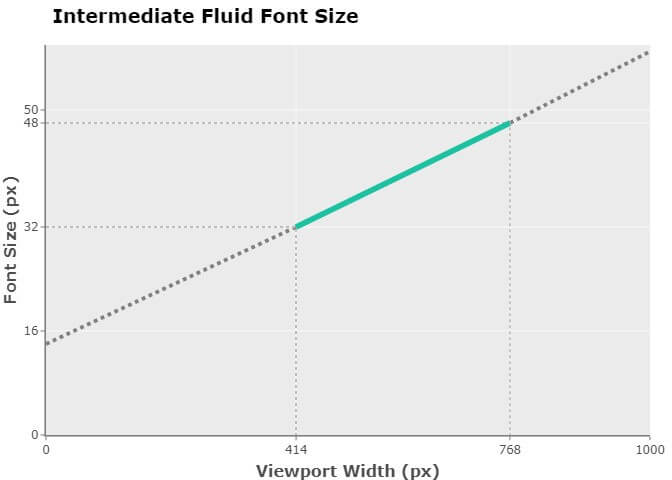
We have now achieved the precision control we were aiming for. When the viewport's width is 414px, the font size is 32px. When the viewport's width is 768px, the font size is 48px. Solving for any other viewport width (x) and font size (y) on the same line with a slope of m = 0.04519774011, we can use the point-slope formula y — 32 = 0.04519774011(x — 414).
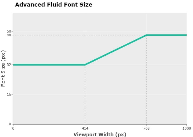
Advanced Fluid Font Size
Another drawback of setting the font-size property to a vw unit is that this may result in extremely small or large font sizes. What if you wanted the font size to never go below 32px or above 48px?
In order to set boundaries for the font size, we need to use CSS's clamp() function.
According to the MDN Web Docs,
theclamp()CSS function clamps a value between an upper and lower bound.clamp()enables selecting a middle value within a range of values between a defined minimum and maximum. [It] takes three comma separated expressions as its parameter, in the order of minimum value, preferred value, maximum value.
So, if we were to set the first parameter to 32px and the third parameter to 48px, we would have a font size that would never go below 32px or above 48px.
Let's update our example to use CSS's clamp() function :
:root {
  /* Declare without units so we can compute the slope */
  --min-vw: 414;
  --max-vw: 768;
  --min-h1-font-size: 32;
  --max-h1-font-size: 48;

  /* m = (y2 - y1) / (x2 - x1) */
  --rise: calc(var(--max-h1-font-size) - var(--min-h1-font-size));
  --run: calc(var(--max-vw) - var(--min-vw));
  --slope: calc(var(--rise) / var(--run));
}

h1 {
  /* Due to the way addition and subtraction works in calc(),
  we need to "type cast" --min-vw and --min-h1-font-size to appropriate units */
  --min-vw-px: calc(var(--min-vw) * 1px);
  --min-h1-font-size-px: calc(var(--min-h1-font-size) * 1px);

  /* y - y1 = m(x - x1) */
  --fluid-font-size-px:
    calc(
      var(--slope) * (100vw - var(--min-vw-px)) + var(--min-h1-font-size-px)
    );

  /* "Type cast" --max-vw to px */
  --max-h1-font-size-px: calc(var(--max-h1-font-size) * 1px);

  font-size:
    clamp(
      var(--min-h1-font-size-px),
      var(--fluid-font-size-px),
      var(--max-h1-font-size-px)
    );
}
As you can see, when the viewport is 414px and below, the font size is 32px. And when the viewport is 768px and above, the font size is 48px. The font size is only fluid when the viewport's width is between 414px and 768px.
Some Final Thoughts
- To keep the examples simple, I set the
font-sizeproperty in px. This is not recommended by the Web Content Accessibility Guidelines (WCAG) . - Designers may argue that font size should be based on the element's container, not the viewport's width. Unfortunately, container relative lengths are not part of the CSS specification as of yet.
- Support for
calc()and support forclamp()are both fairly good. - You can also apply the same techniques for fluid font sizes to implement fluid line heights.
That depends on the devices your website needs to support and the aesthetics you wish to achieve.
Ideally, you would base your range on your website's statistics. Absent that, you can review a worldwide screen resolution statistics resource.
Pick a font size that is readable and accessible. For websites, regardless of device, the general consensus seems to be:
- Primary text should be
16px - Secondary text should be about
2pxsmaller than the primary text (so, about13pxor14px) - Text input should be at least
16px(so, about18px)
As for headings, this is where you have the most flexibility to take advantage of fluid typography. Headings tend to be bigger than the primary text and therefore have the most room to resize.
For ideal readability, aim for a line height that is about 130% to 150% the size of the font (so, 1.3 to 1.5). For optimal readability and accessibility, try 140% to 180% (that's 1.4 to 1.8).
Smaller fonts require more line height, which is why you may want to specify a start line height that has a greater value than the end line height (assuming your font size is adjusting proportionally to the viewport's width).